The Myth That a Busy Noticeboard Reaches Everyone
A busy noticeboard can hide useful local information. Learn how to group announcements and set a clear reading order so neighbors can find what they need.
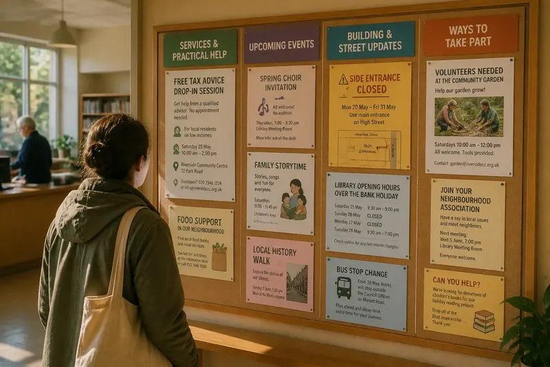
How can a neighborhood noticeboard help people find one useful announcement without making them sift through every other one? A busy noticeboard often reaches fewer readers than its crowded surface suggests: a food pantry schedule, a street closure, and a choir invitation may all be visible, yet none is easy to spot. The remedy is not simply to remove more paper. It is to give information a clear place and a visible reading order.
That matters in the ordinary places where residents pause: a library entrance, laundromat, clinic lobby, or building foyer. Someone passing through may have only a moment to check for a changed bus stop or a local service. A board should help that reader decide quickly where to look, what applies, and what to do next.
Read the board as a passerby
Before rearranging anything, stand where a person first sees the board. Notice whether a doorway, counter, glare, or queue blocks part of it. Then look at the surface for only a moment and ask what appears to matter most. If the answer is unclear, the board is asking readers to do the organizing themselves.
Check the distance as well as the content. A heading that works when someone is close may disappear from the entrance. Small print, pale ink, and tightly packed pages make a reader move closer and search longer. A board should offer an obvious first point of attention, not a wall of equally loud notices.
Walk up to it and look for the basic information on a typical notice: who it is for, what is happening, where, when, and how to follow up. If those details are scattered across a long paragraph, the announcement may be easy to overlook even when it is in the right section.
Start by writing down what a visitor actually needs to find. That keeps the redesign tied to use rather than appearance.
Set the board’s purpose
Decide what the board is meant to do before assigning space. A lobby board might focus on building services and nearby public information. A library board may also carry learning events, volunteer requests, and community notices. The purpose can be broad, but readers still need a dependable way to tell one kind of information from another.
Ask the people responsible for the location what they need the board to carry, and ask a few regular visitors what they tend to seek. A caretaker may need a place for maintenance notices; a parent may look for after-school activities. These needs can coexist if each has a recognizable home.
Keep the board’s limits visible to contributors. If every group assumes its event belongs at the center, the center stops communicating priority. A simple posting policy can say which topics fit, who approves notices, and where time-sensitive information goes.
Define the board’s job in a sentence that contributors can understand and follow.
Group notices by reader need
Sort announcements by the question a reader is trying to answer, rather than by who submitted them. Useful groups might include:
- Services and practical help: food support, public advice sessions, or local repair options.
- Upcoming events: gatherings, classes, performances, or neighborhood meetings.
- Building and street updates: changes to access, opening arrangements, or local works.
- Ways to take part: volunteer invitations, resident groups, and requests for shared help.
Choose labels that match the place and the people who use it. “Help nearby” may be clearer than an official department name; a building’s residents may prefer “For this building” to “Notices.” Keep categories distinct enough that a reader can predict where an item belongs. If one announcement seems to fit several groups, give it one main location and add a short pointer elsewhere only when that genuinely helps.
Say you are organizing a board in a neighborhood library and receive a notice for a free tax-advice session hosted at a community center. Its primary place might be “Services and practical help,” with the center’s address and booking contact made easy to see. The expected result is that someone seeking assistance can scan one section without reading through unrelated event invitations.
Choose a visible reading order
Groups alone do not tell the eye where to begin. Arrange them in an order that follows a reader’s likely purpose. A section for urgent or changing practical information may sit near the top, while ongoing invitations can sit lower down. The order should reflect the board’s actual job, not a universal formula.
Use clear section headings and make their appearance consistent. A colored strip, a simple border, or a plain heading in larger type can separate groups without turning each notice into a competing poster. Leave space around headings so the boundary between sections is easy to recognize.
Within each section, make the reading path predictable. Place newer or soon-to-happen notices at the front of the section, and keep recurring information in a separate, clearly marked area if it would otherwise be displaced. Avoid covering one notice with another or placing a small update over a large poster. Readers should not have to guess which page is current.
Try the arrangement from the entrance, then from close up. If the board has a glass cover, check for reflections at the times the space is usually used. A tidy layout that cannot be read from the normal approach is still a difficult board.
Make each notice scannable
A well-placed notice can still be hard to use if its main details are buried. Ask contributors to put the event or service name first, followed by the action a reader can take. Use short blocks of text, legible type, and a strong contrast between words and background. Decorative fonts and busy images may make a poster attractive to its organizer but slow down someone searching for a date or phone number.
Encourage a consistent order for essential details:
- What the service, event, or update is.
- Who it is intended for, if that is limited.
- When it happens or when the information applies.
- Where to go, including a useful room or entrance detail.
- How to ask a question, register, or get more information.
Do not rely on a QR code as the only route to details. Some readers may not have a smartphone, may not want to scan a code, or may need to see the essential information before deciding to follow a link. Include a readable web address, telephone contact, or in-person option when available.
Use plain language for access details. “Enter through the side door beside the garden” gives a clearer cue than a building nickname a visitor may not know.
Keep the board current
Outdated notices compete with useful ones and make the whole surface feel uncertain. Give each notice a visible end date or review date, and assign someone to check the board as part of an existing routine. That person can remove expired material, confirm that ongoing information still applies, and ask contributors to replace faded or damaged pages.
Make the process easy for people posting notices. Provide a contact name or drop-off point, explain whether approval is needed, and say what details a notice should include. If contributors have to guess at the rules, they may tape up duplicate pages or leave information in the wrong place.
When a change is urgent, give it a distinct, agreed position rather than allowing it to cover other notices. Remove or relocate it when the issue has passed. The board should make changing information prominent without teaching readers that every bright paper is an emergency.
Questions readers ask?
How many notices should a board hold?
There is no useful fixed count because a small board in a busy entrance has different demands from a large board in a quiet hallway. Keep only notices that fit the board’s purpose, can be read clearly, and still have a current reason to remain.
Should local services go at the top?
Place them where the board’s regular readers can find them quickly, which may mean near the top or in a clearly marked section. If residents often seek practical help there, make that group easy to spot without crowding out other essential updates.
What if a notice fits two sections?
Choose the section that matches the reader’s main reason for looking, then make the title and contact details clear. A small cross-reference can help, but duplicating the full notice in several places can create confusion when one copy changes and another does not.
How can a board include people who do not read English well?
Use plain wording, familiar symbols where appropriate, and translated notices when the location can provide them. Keep key details visible in the languages readers use locally, and do not assume a picture or icon carries the same meaning for everyone.
Review the reader’s route
After arranging the board, ask someone who did not organize it to find a particular kind of information. Give them a natural request, such as locating a nearby support service or finding when the next meeting takes place. Watch where they look first and which headings they understand without explanation. Their route can reveal a missing category or an unclear label.
Make one change at a time when the board is hard to scan. Moving a heading, shortening a label, or separating recurring information may be enough. If everything is changed at once, it becomes harder to tell which part of the arrangement helped readers.
A busy noticeboard does not serve a neighborhood simply by holding more paper. It serves people when the most useful information has a clear home, a readable path, and a current contact. Keep the categories and reading order consistent, and a passerby can spend less time decoding the board and more time acting on what matters.
For a noticeboard serving local services, that clarity is a practical form of welcome: put the help a reader may be seeking where its label makes sense, and make the next action unmistakable.